


Downtown Studio Reveal!
- Mara Krueger
- Mar 19, 2020
- 6 min read
We finished this project last fall (2019) and it's definitely one of our favorites to date! We are so excited to finally be sharing a full reveal of this bright and beautiful studio space!! Before we get into everything, we want to share some background details and before images to give you a feel for what this space was like when our client first bought it. Kaleigh Gamache, of Kaleigh Rae Photography, is from the Milwaukee area originally but was living in New Jersey when she found the condo for sale. She was dabbling with the idea of acquiring a space in Milwaukee that could double as a place to stay when she was back in town visiting, as well as a personal photography studio. She also had the intent of renting it out for future bloggers, photographers, stylists, artists, bridal parties, etc. So she sent us this condo listing and asked what we thought! Since she was in New Jersey at the time, we went that morning and face-timed her when we were there! I'm sure you all know by now since this is a reveal post....she bought the condo and that Milwaukee studio idea very quickly became a reality!
All photography within this post: Kaleigh Rae Photography
BEFORE PHOTOS


LAYOUT CHANGE & STAIRCASE REWORK


The biggest overall change we made was taking out the chunky staircase and closet that blocked off a lot of the main floorplan. This opened up the entire space and let in much more light. The new staircase was built tight to the left wall and the lower section stair treads cantilevered over the edges of each step for a crisp modern design. The layout change also added more usable space to the upstairs loft/bedroom area, anything that adds more functionality is a big win in our books!
When it came to the new railing, we had a local metalworking artist out of Waukesha - NextGen Metalworks make two different custom railings for both the lower staircase and the upper loft/bedroom area. All the railings were powdercoated in a matte black finish and for the upper railing he worked with a glass fabricator to include glass inserts. It was important to Kaleigh to maximize the amount of natural light in every inch of this studio.
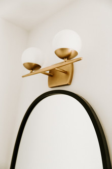
BATHROOM

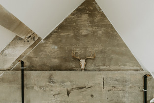
The bathroom before had a solid layout, it was just a bit dark and uninviting (scroll up if you need a few before picture reminders). A little paint would have done wonders even if they hadn't decided to move forward with renovating this space. In fact, it wasn't originally in the plan...but after spending a few nights there, Kaleigh had a run in with the bathroom faucet and decided it was a go. We might be bias, but we're so glad they decided to do it at the same time as the rest of the renovation! Especially with how it all turned out! Some of the main elements in the condo like the concrete floors, beams, and walls, soaring vaulted ceilings, the cream city break walls, and HUGE floor to ceiling windows in the main space already give this place so much charm. It was such an awesome space already, we just wanted to strip it down and simplify the design to compliment and show off all those elements.


Sources:
Shower Tile - 3x6 white subway from Floor & Decor, similar option linked below
Shower Floor Tile - white hexagon mosaic from Floor & Decor, similar option linked below
Shower Trim Kit - Moen, linked below (we also got a longer shower arm attachment)
Shower Glass - Glass Shower Door Co (Out of Menomonee Falls, WI)
Toilet - Kohler (linked below)
Shelves - 2x12s from local hardware store, sanded, stained, and coated with poly
Shelving brackets - Cascade Iron Co
Light Fixture - Wayfair (linked below)
Matte Black Towel Ring - Kohler (linked below)
Brass Faucet - IKEA - hamnskar
Bathroom Vanity - IKEA Godmorgan (we did not purchase the faucet included in this set)
Mirror - Umbra, linked below
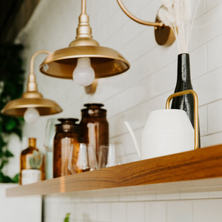
KITCHEN
The kitchen area before had minimal dated yellow oak cabinets and blue counter-tops (see pictures for reference). We played around with several different layouts before deciding on utilizing the same main wall for everything so we could minimize costs in relocating plumbing and electrical. While the layout stayed similar the overall aesthetic of the entire space is entirely different.
Lets talk cabinetry. We went with IKEA cabinet boxes but chose to use a company called Semihandmade for all the door/drawer fronts, panels, etc. Semihandmade makes custom cabinet fronts specifically for IKEA cabinet boxes. They have tons of different door front styles and colors to choose from. We had used them before this project and were extremely impressed with the materials and craftsmanship of their products, so when Kaleigh wanted to use them we were thrilled to work with them again! We love how customize-able the IKEA/Semihandmade combo can be, and in our opinion their slow close door and drawer hardware is some of the best functionally among RTA cabinets. We went with the cabinet color - desert grey to compliment the hue of the concrete floors already in the studio.


Not only does Semihandmade make custom panels, trim, and door/drawer fronts for IKEA cabinets, they also make custom floating shelves! The shelves they make are beautiful is an understatement! They are 100% worth every penny. Geddy is picky about floating shelves (especially the mounting hardware) and these are by far some of his favorite to use. The color used here was their "teak" finish.


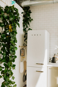
Really the only NON-negotiable of Kaleigh's throughout our remodel and design discussions was that she really wanted a SMEG Fridge. We were so excited that this was important to her! I mean the space was already cool, but we've always wanted to design a space with a retro SMEG fridge, how much cuter can a kitchen get?! Since the kitchen itself was minimal, we wanted to avoid the appliances feeling like they took over. The white SMEG helped with that since it was a statement on it's own. We also used a built in Bosch dishwasher and ordered a custom panel from Semihandmade to match the rest of the cabinet doors. This allowed it to blend right in and give the illusion of more lower cabinetry. The stove was a slide in electric range from Frigidaire and the built in lower microwave was IKEA's.


We always think of the small details like cabinet hardware, lighting, and plumbing fixtures to be the 'jewelry' of a space. Here we used the half moon pulls from the Sarah Sherman Samuel line at Semihandmade. They are real brass that patina over time to give a gorgeous matured look. The faucet is a great affordable option from amazon! It's not always easy to find good gold options that don't break the bank, but this one is beautiful and works so well! The sink is a white under-mount quartz/acrylic material complete with solid bright white quartz counter-tops. The brass light fixtures are a STEAL from amazon at under $40! linked below and SO cute in person...run and grab them! Finally to complete the kitchen with a classic clean look, we took the subway tile backsplash across the whole wall from the floor all the way up to meet the concrete. This really elevated the look and draws your eye up to those amazing vaulted ceilings.


UPPER LOFT
The final space we completed was the upper bedroom loft area. The stairs leading up came out right in the middle of the area, so moving them changed the whole upstairs floor-plan and gave them more usable space. The existing flooring was tongue and groove 2x6 boards, which were installed upside down (beveled edge up). This created an easy spot for dust to collect and was not functional from a cleanliness standpoint. Also because of the layout change, there was no way to patch it in without replacing all of it. So, instead, we installed a whitewash LVP (luxury vinyl plank) flooring throughout the whole upper level which made a huge difference and tied in the concrete walls really well!
The other big change was the strange area along the back wall where the air conditioning unit and the radiant heat manifold were stored. It was a weird boxy area used for storage or a closet of sorts with shelves and an obvious access panel. The whole thing seemed to be more of an afterthought. We re-framed the area to go straight up to the ceiling peak and added shiplap all the way up. Then we built a shiplapped access panel to match the wall and fit flush with the rest. We painted the whole wall a rich matte black. This tucked away the storage behind the shiplap and made the whole thing feel so much more intentional!


UNTIL NEXT TIME!
